A Pantone match is an ink color mixed to a specific Pantone Matching System reference number, so the bank logo prints exactly the same blue on every pen, polo, tumbler, and tote across every vendor and every production run. Without a Pantone lock on the brand color, the logo drifts by 8 to 12 percent in perceived color across a single branch-opening order. That is the difference between a brand standard and a brand suggestion.
Pantone Matching System, abbreviated PMS, is the ink-mixing standard the printing industry has used since 1963. A Pantone Coated value, like PMS 281 C, references a specific ink formulation printed on coated paper. A Pantone Uncoated value, like PMS 281 U, is the same color on uncoated paper, where the ink absorbs differently. The two look slightly different. A bank brand standard usually specifies both.
Why a bank logo drifts without a Pantone lock
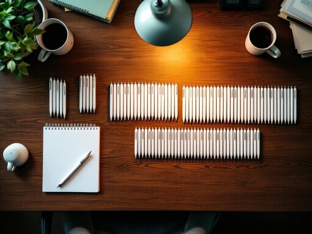
Three failure modes show up on branch-opening orders. First, the pen vendor ran the pen barrel in the standard navy ink that came with the pad printer cartridge. The standard navy is roughly PMS 540. The bank brand is roughly PMS 281. Those two navy values look the same on a screen and look noticeably different on a polo on the teller line.
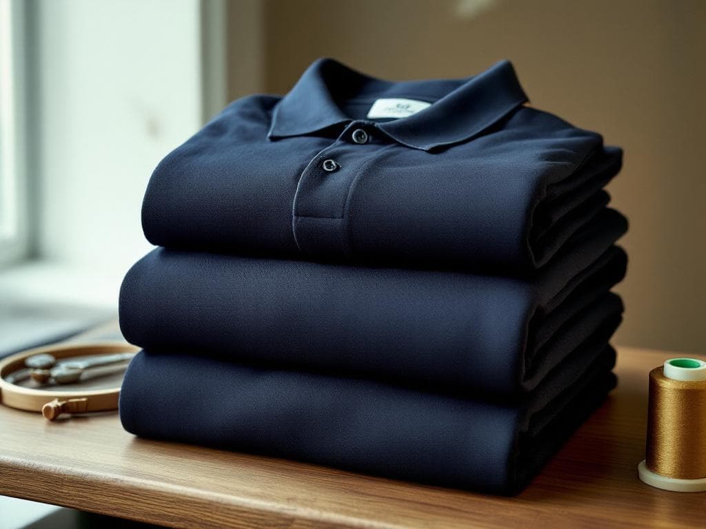
Second, the embroidery vendor selected a thread color from a stock thread chart without a Pantone reference. Madeira thread color 1342 is a close match to PMS 281, but not exact. Robison-Anton thread color 5841 is also a close match, also not exact. The polo on the staff shoulder runs in 1342, and the tumbler powder coat runs in PMS 281 exact. The brand reads inconsistent across the kit.
Third, the tote bag vendor ran a 4-color process print instead of a Pantone spot color. Process color simulates a Pantone using cyan, magenta, yellow, and black halftone dots. The simulation is close, not exact. On a non-woven polypropylene tote, the simulation drifts further than it does on coated paper. The tote logo reads slightly purple where the polo reads true navy.
How to lock the Pantone on a community bank branch order
- Find the brand standards PDF. It should specify Pantone Coated, Pantone Uncoated, CMYK process equivalents, RGB digital equivalents, and hex codes for web. If you do not have a brand standards PDF, ask the marketing director or the corporate office. If one does not exist, this is the moment to build one. It pays back inside 18 months on vendor consistency.
- Send the brand standards PDF with every quote request. Not just the logo PNG. The PDF tells the production vendor exactly what to mix.
- On embroidery, ask for the thread color reference. Madeira 1342, Robison-Anton 5841, or the closest equivalent to your Pantone. Embroidery thread is not perfectly mappable to Pantone, so the vendor should sew out a pre-production sample.
- On powder-coated tumblers, asking for a Pantone match can be expensive and require a high volume order. That is available if you have the time. We will guide you with the best matches possible.
- On 4-color process printing, ask the vendor to convert the Pantone to spot color where possible. Spot color is more accurate on logos under 4 colors total.
What a Pantone match actually costs
On a one-color pad-printed pen, a Pantone match is a $25 to $45 ink-mixing fee. One time, not per-unit. On a 4-color process print on a tote bag, a Pantone match is not available, but the spot-color conversion is the workaround at no upcharge. On embroidery, the thread color is sourced once, the digitizing is locked, and reorders run at no setup. Across a 1-branch opening kit at the quantities in the branch-opening article, the total Pantone-lock cost is worth the additional cost and effort. The brand consistency it buys lasts the life of the kit.
If you have a brand standards PDF and you want me to quote against the exact Pantone on a flagship item, send the PDF with the quote request to SteveGoddu@GodduImprint.com or call (603) 890-2406. I quote with the Pantone reference on the PO, sew out the sample before I cut, and send a daylight-balanced photo of the proof before production starts.